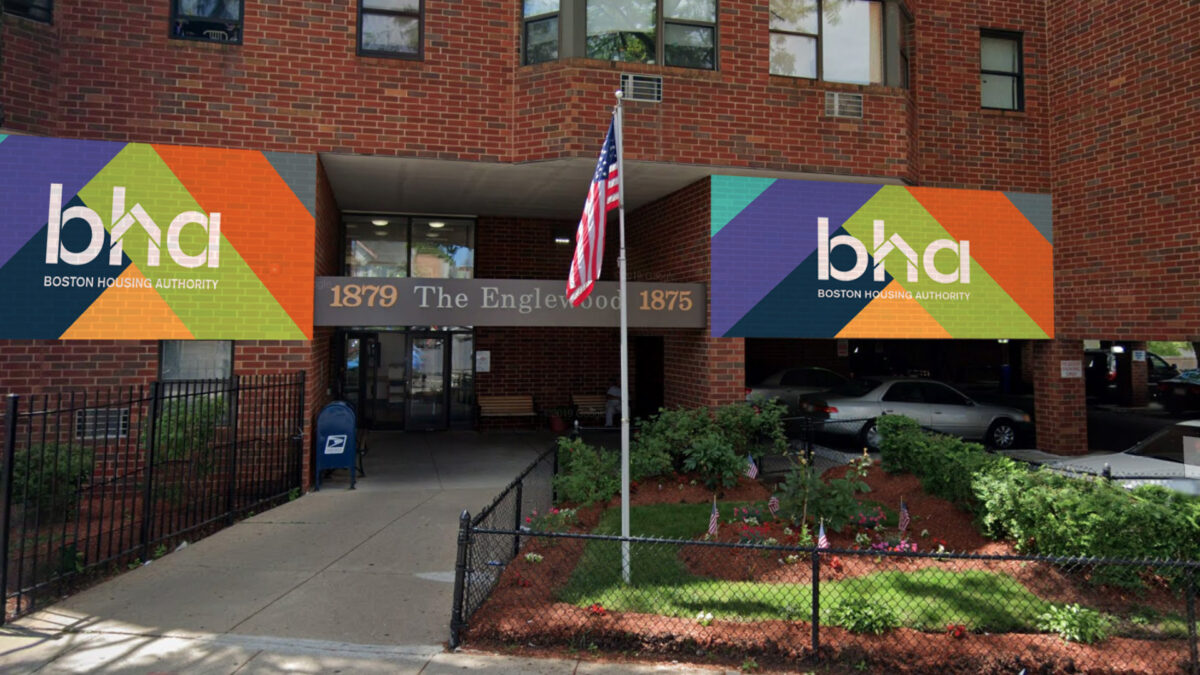
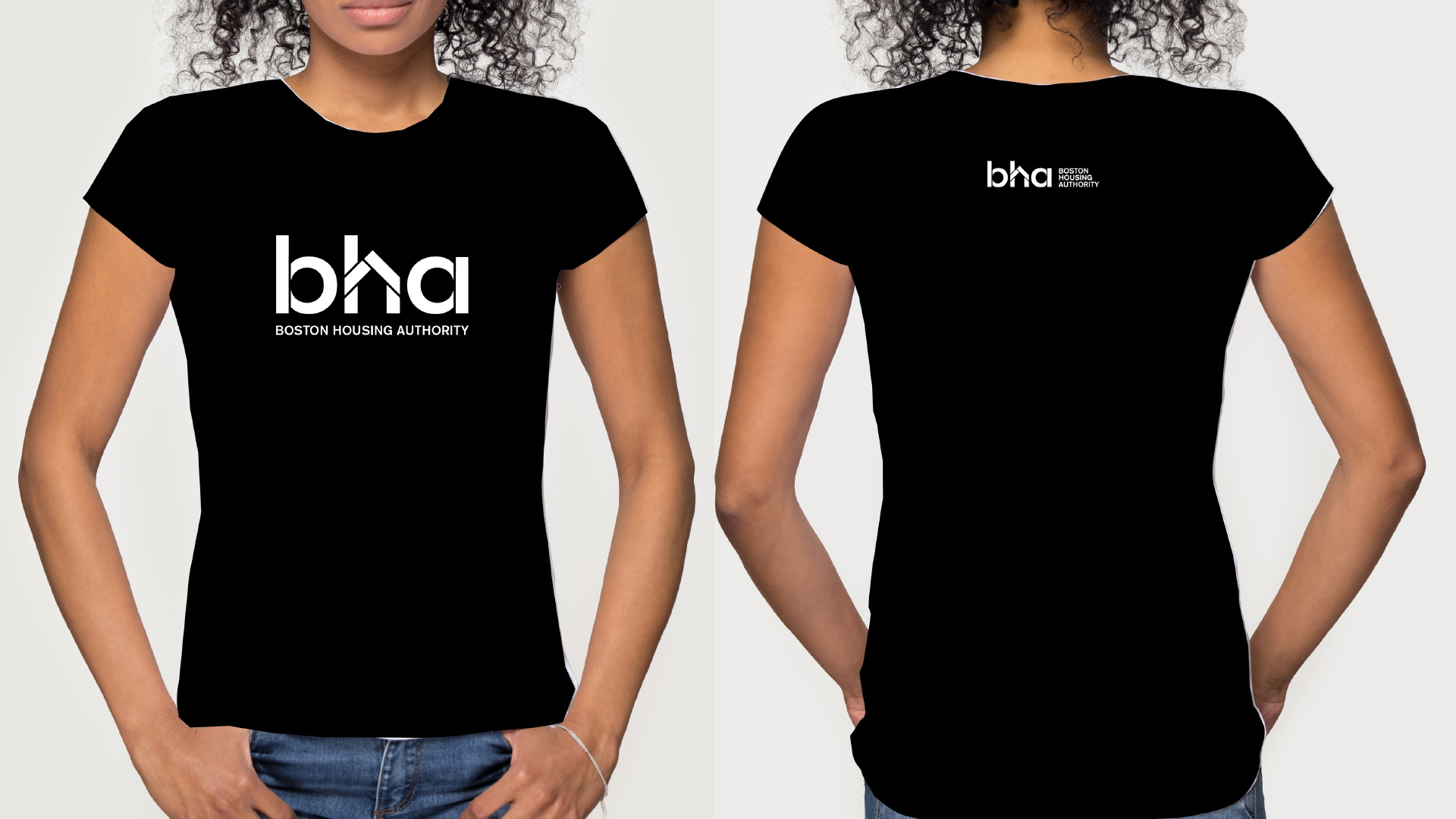
Boston Housing Authority fosters vital communities that are essential to our city’s economic diversity and way of life. As the largest housing provider in Boston, and the only one with civic mission, they bring stability, opportunity, and peace of mind not only to the thousands of lower- and middle-income families they support but to the city as a whole.
Brand Attributes
People-Centered, Community Focused, Value & Values-Driven, Purposeful & Proud, Dynamic & Modern

Defining the goal
At the most fundamental level, we’re not just rebranding BHA:
We are creating an identity for the idea that public support for affordable housing is an effective investment in our quality of life. It builds community and creates opportunities for everyone.
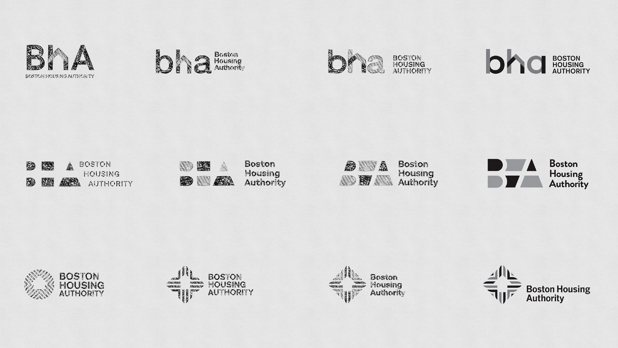
Concepts
Color Palette
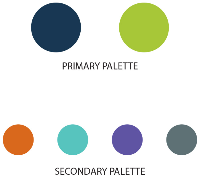
The color palette is dynamic yet welcoming, diverse yet connected. The system is designed to ensure flexibility and to be impactful in all communications.
Primary color palette
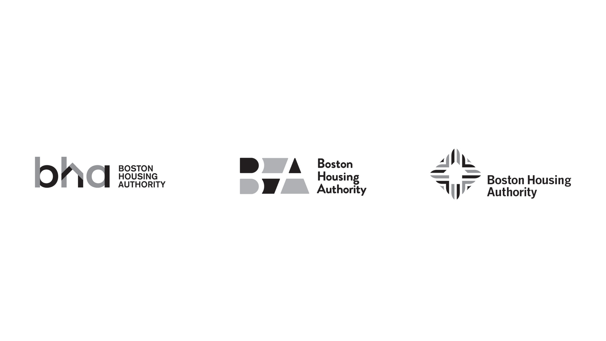
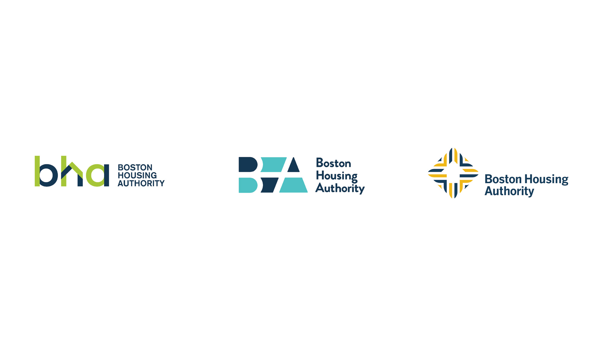
Yellow Green harmonizes with the dark blue creating a balance so that the combination looks fresh, positive, and inviting. The logo can be printed in four-color process, two-color spot PMS, or black and white. The primary color palette should be used on all full-color advertising and collateral. The system has been designed to allow for flexibility and variety, but the primary colors should always be dominant.
Secondary color palette
The secondary color palette is intended for accents, website backgrounds, special photographic treatments, and information graphics such as tables, charts, and graphs. The secondary color palette should neither replace the primary palette nor play a leading role in collateral.
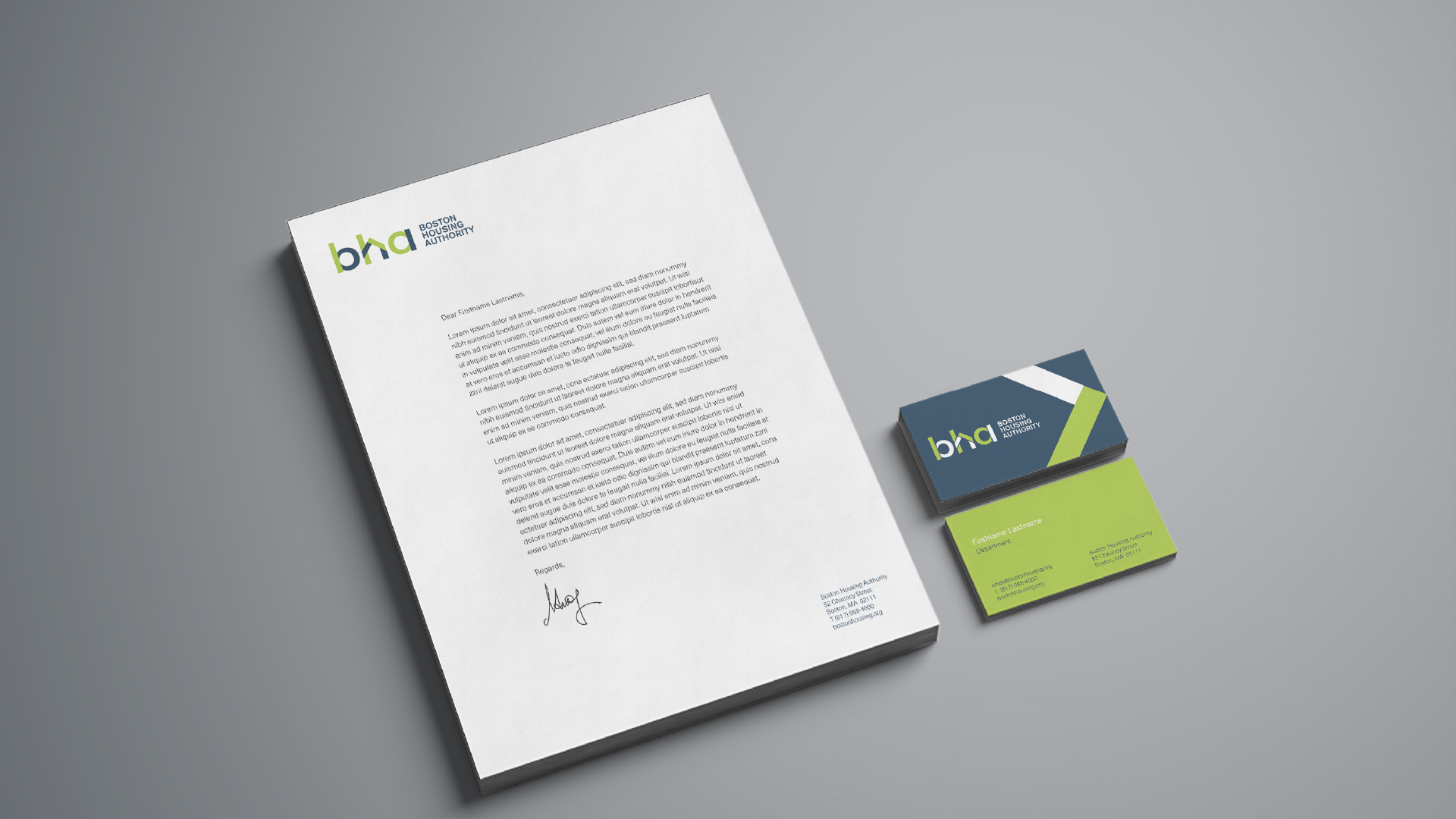
Logo in Action
